For Wefurbish, we created a visual identity with a steady, structured base — professional and calm, yet full of character. It was important that the identity wouldn’t overshadow their clients, but still stand confidently on its own. Clean, modern, and human, with just enough boldness to be memorable.
Wefurbish
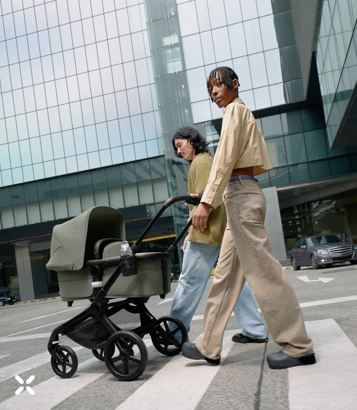
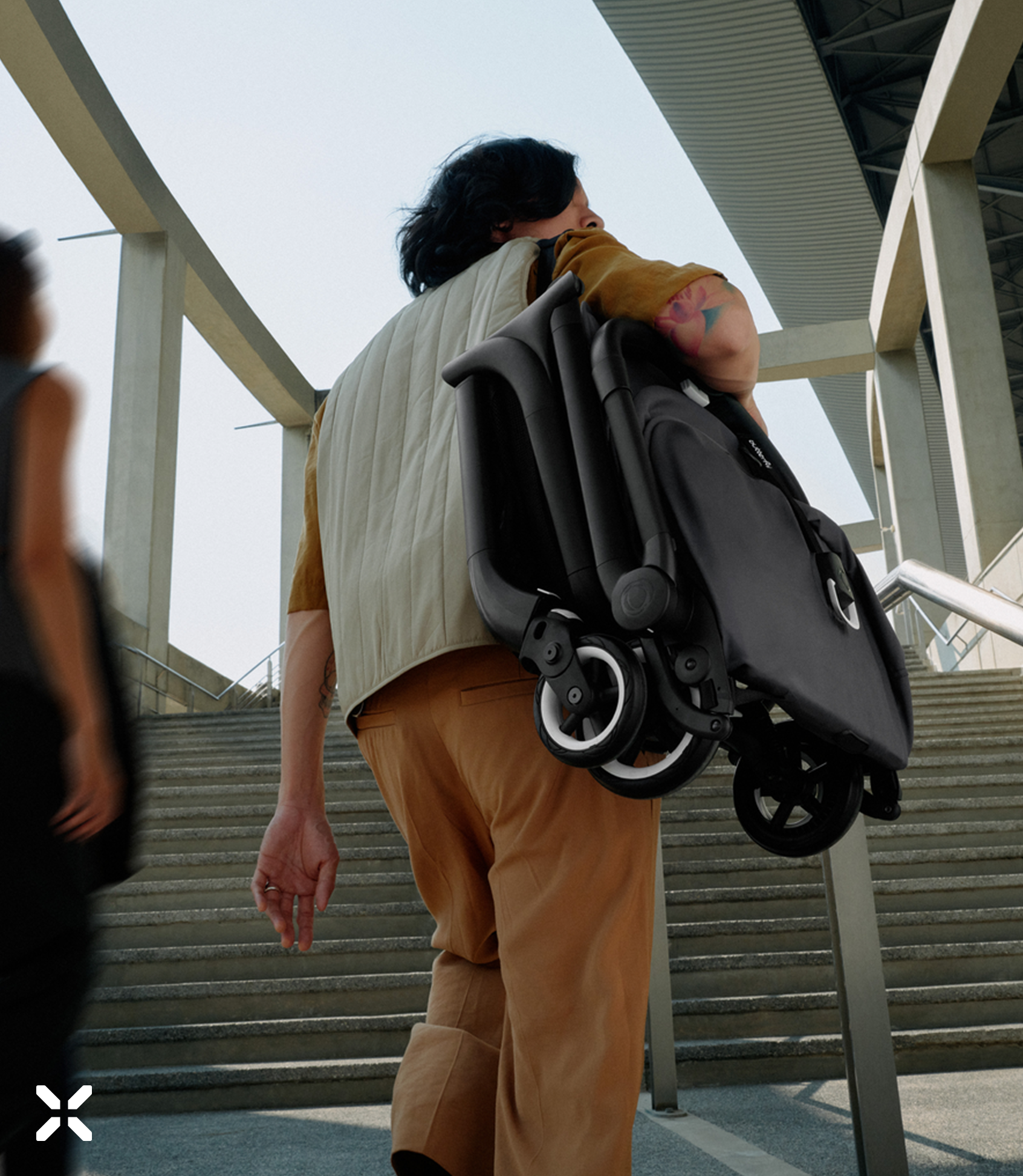
At the heart of the identity is the logo, a simple mark with layered meaning. The x represents collaboration, reflecting their working together with partners across industries. Hidden within the negative space lies a subtle +, symbolising the added life each product gets through refurbishment. It’s a quiet nod to the brand’s core belief: if something can be fixed, is it truly broken?
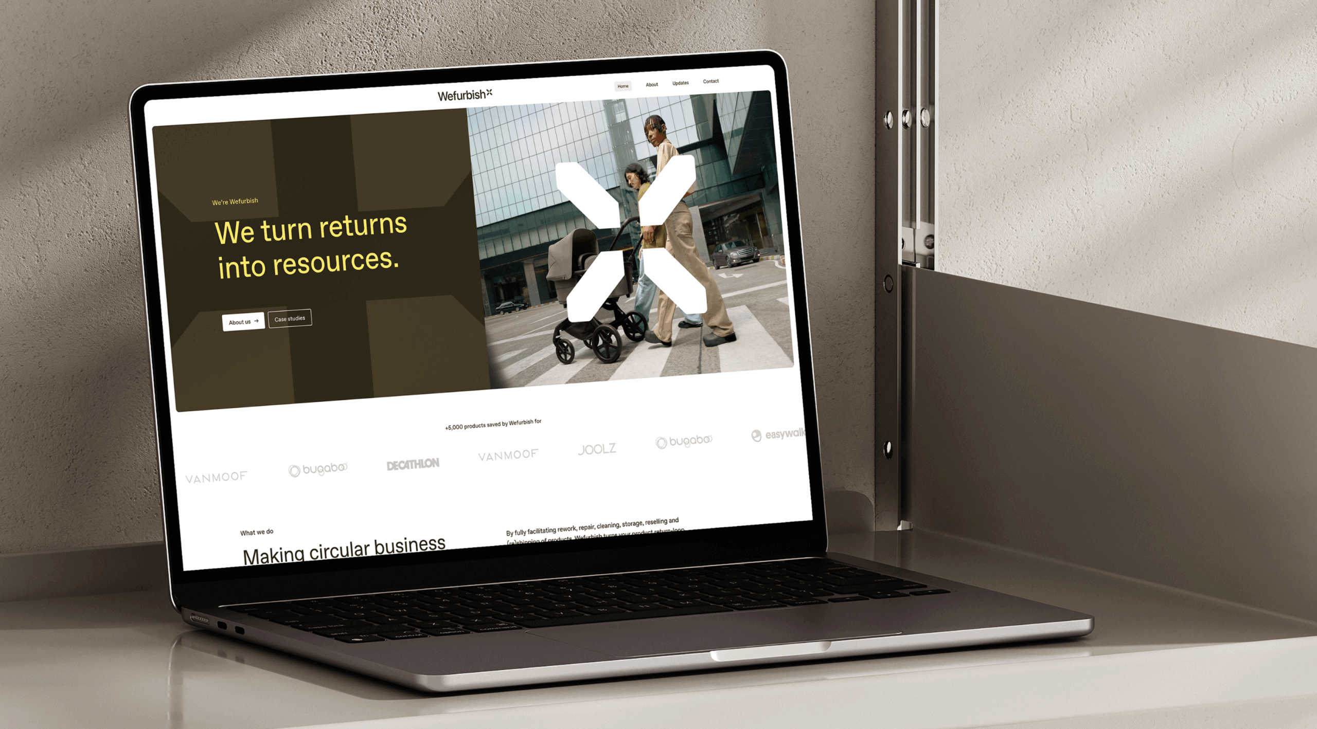

The colour palette plays a central role in the identity. We combined earthy tones to create a calm, grounded foundation. These are balanced with a bolder palette that’s both versatile and lively, adding contrast and energy without overwhelming. It reflects the flexibility of the brand while keeping a clean and professional feel.

More than anything, Wefurbish is about working together, across disciplines, perspectives, and industries, towards a future that’s not just sustainable, but truly circular. It’s a mindset of shared responsibility and long-term thinking. The identity reflects this collective spirit: calm but clear, practical but full of purpose.