Patrick, a purpose-driven creative director in advertising, approached us to create his new branding and website. We loved collaborating with him on this design job, as his passion for sustainability and inclusivity shines through in his creative work for commercial and social enterprises.
Patrick van Haperen
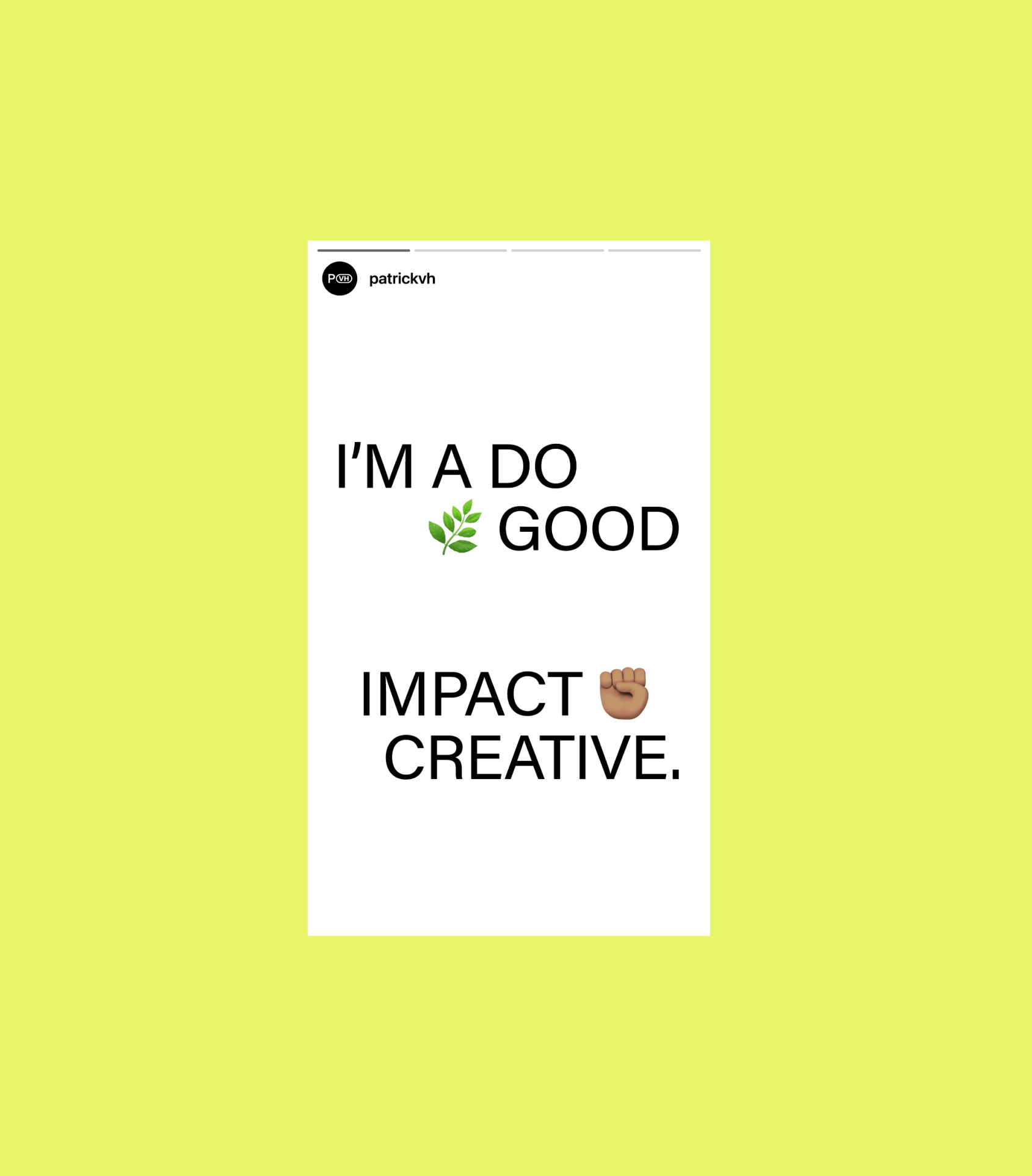
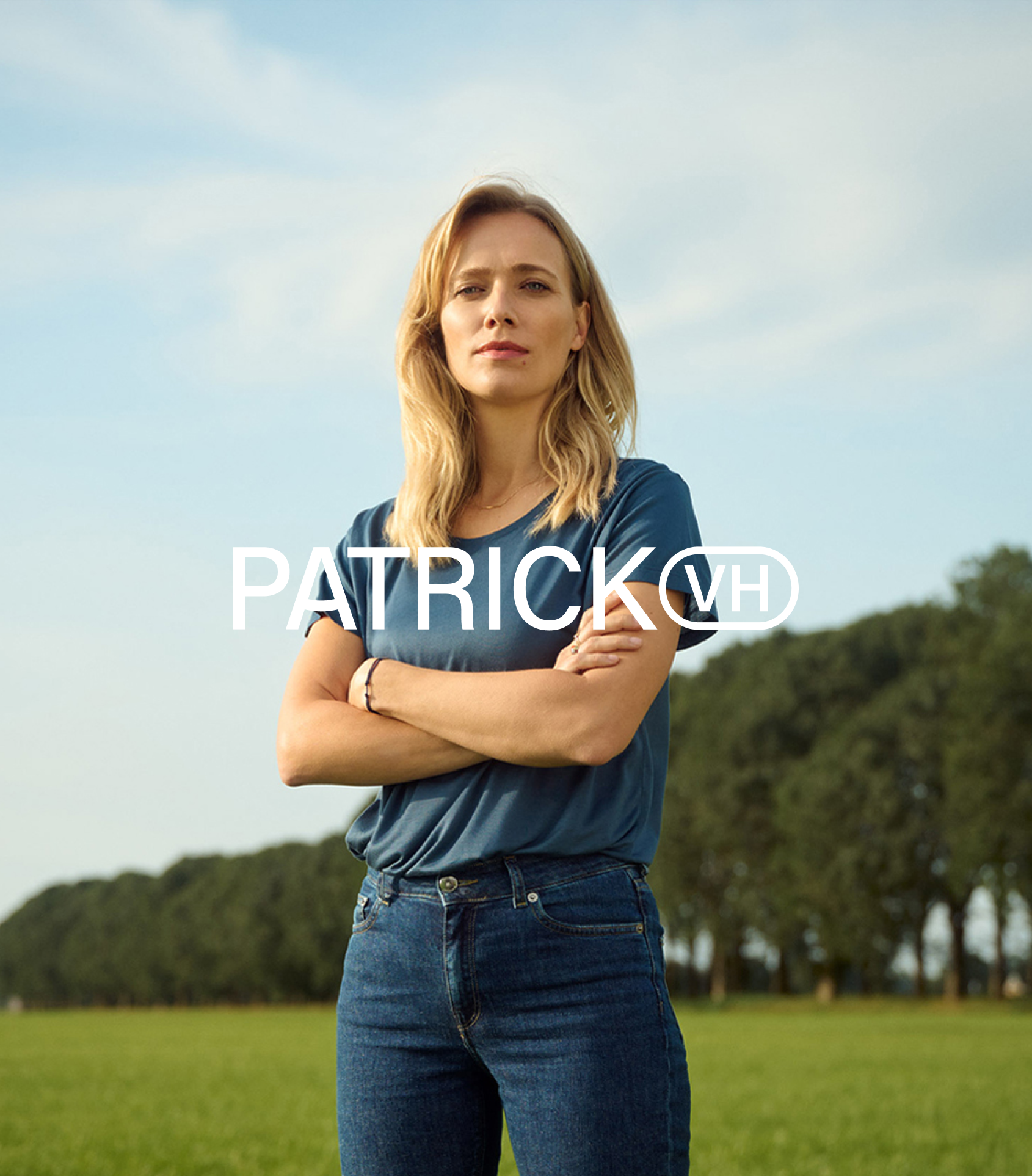
The logo for Patrick combines clean, minimalist design with versatility and recognisability, adapting seamlessly to different contexts while maintaining brand consistency. By incorporating dynamic variations—from P to Pat, Patti, Patrick, and even Patrick van Haperen—it captures the multifaceted nature of his identity and adds a personal touch.
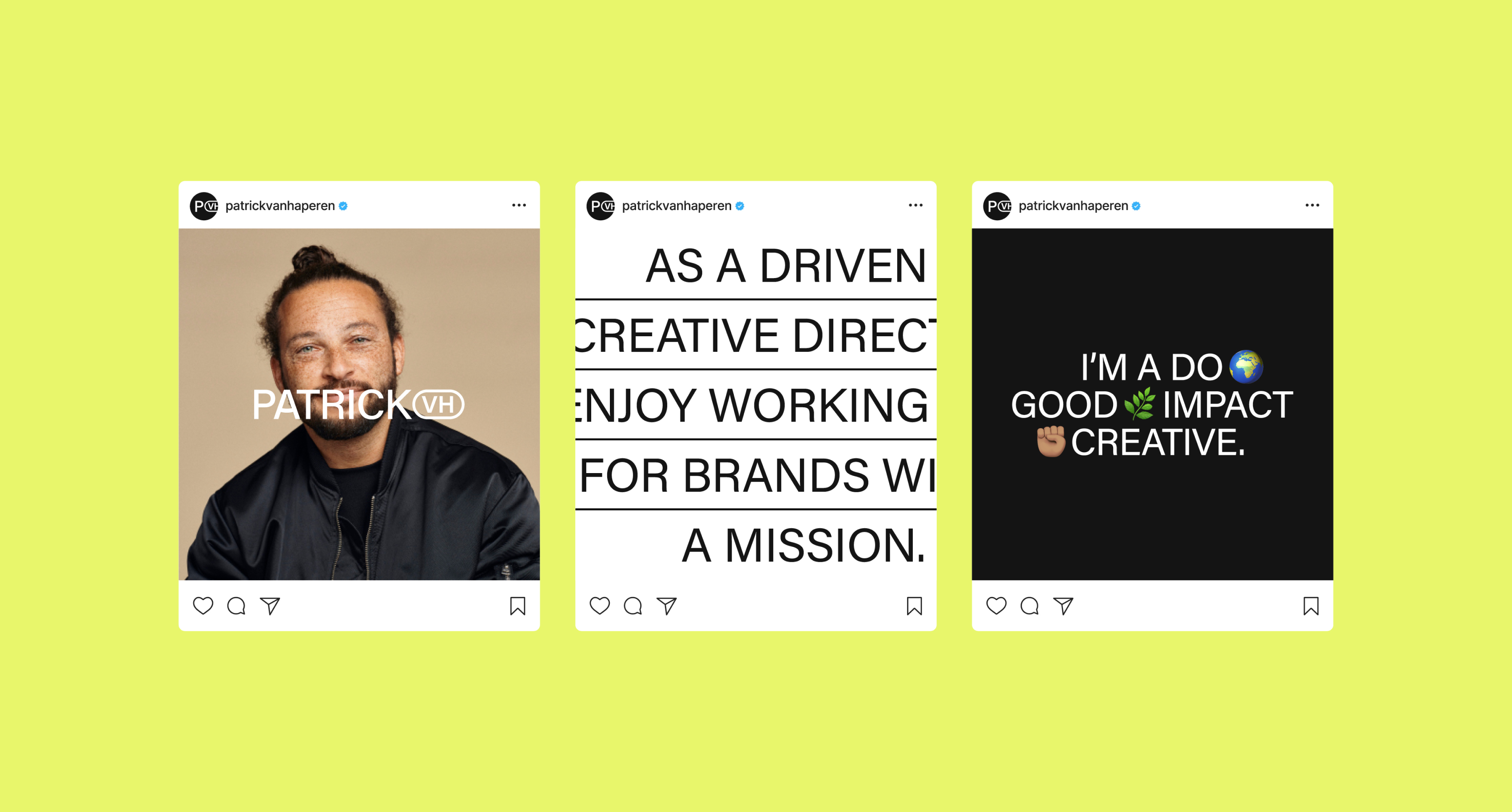
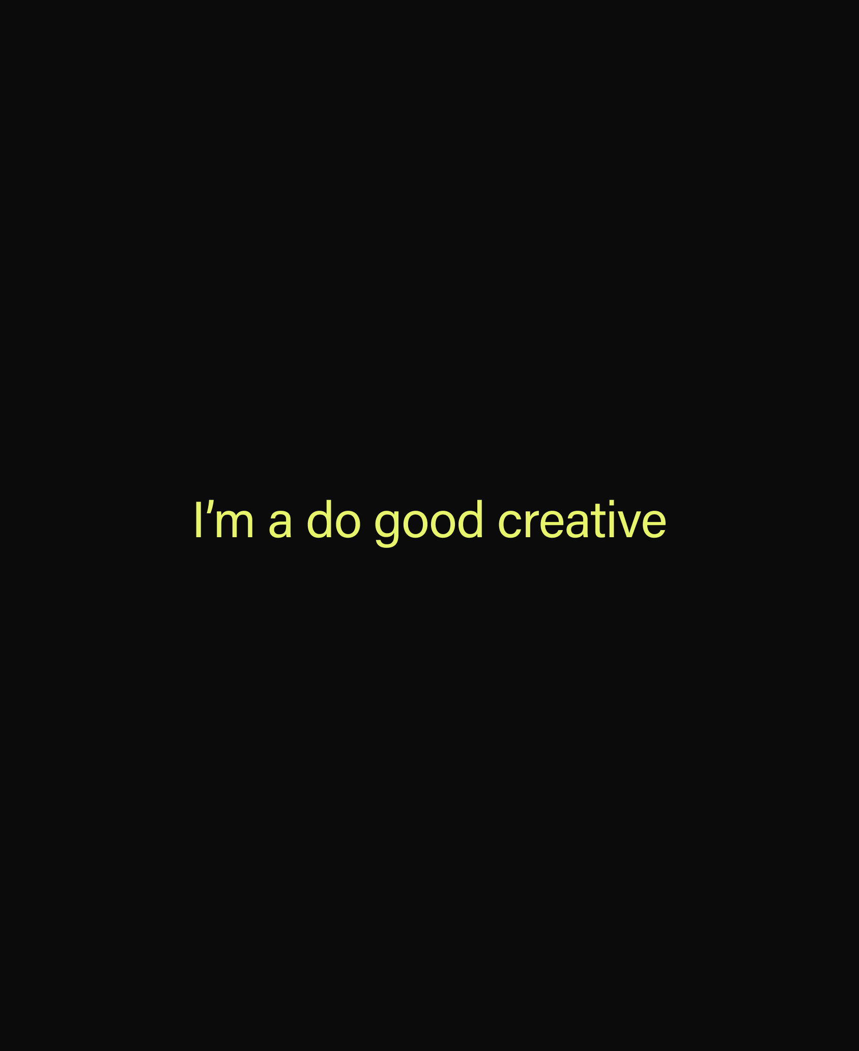
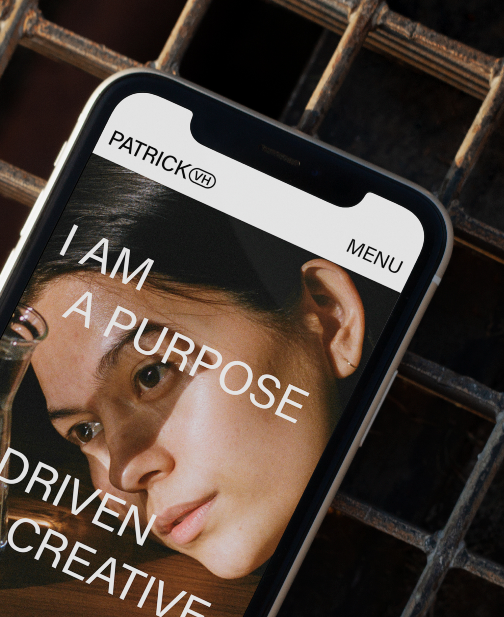
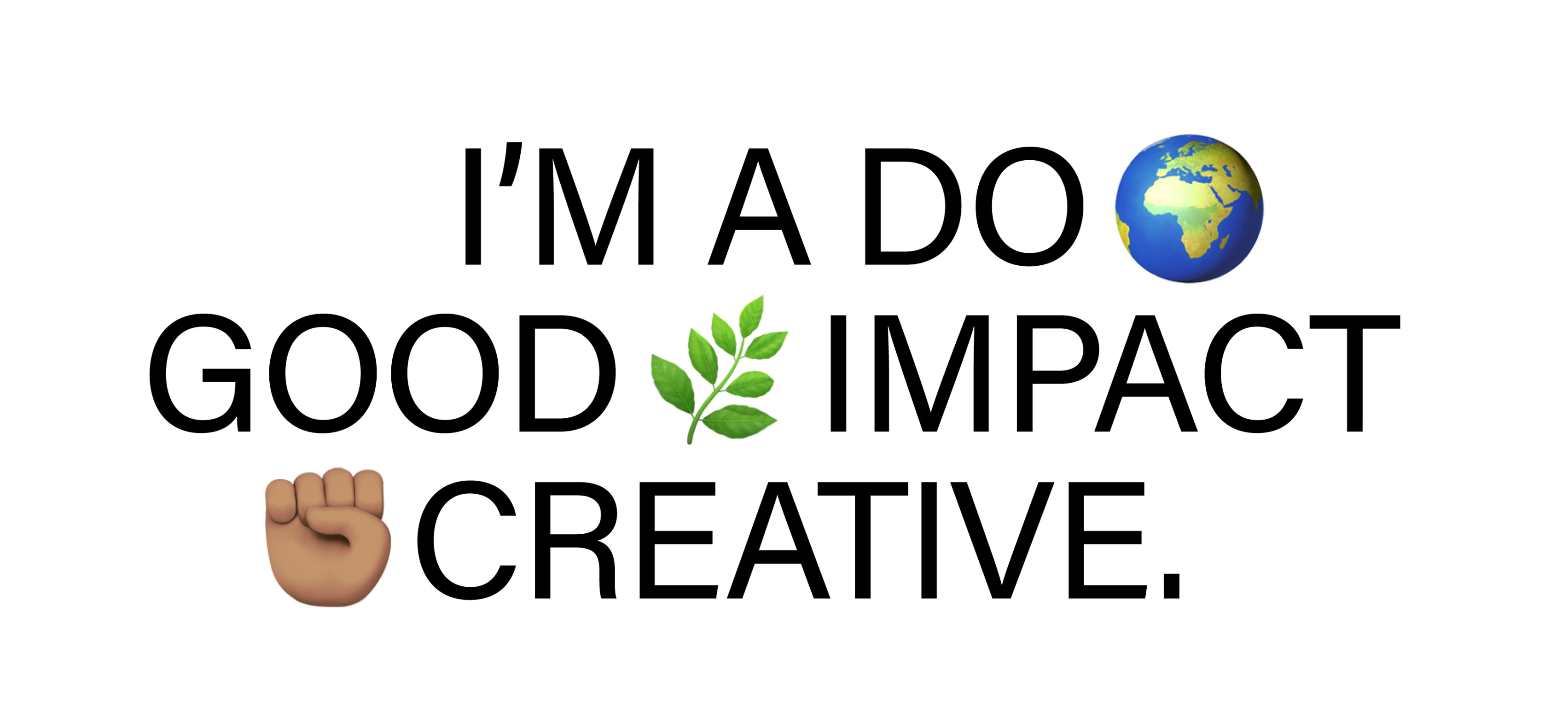
Patrick’s minimal colour palette of black, white, and neon yellow creates a bold visual identity that ensures simplicity, clarity, and energy. This approach allows his client work—not his identity—to take centre stage, ensuring it shines without being overshadowed. The design strikes a balance between universal accessibility and playful charm.
In conclusion, this brand identity reflects Patrick’s purpose-driven approach, blending sustainability, creativity, and a commitment to positive change. Collaborating on this project has been a blast, allowing us to help share his vision through designs that resonate, tell stories, and inspire meaningful impact.