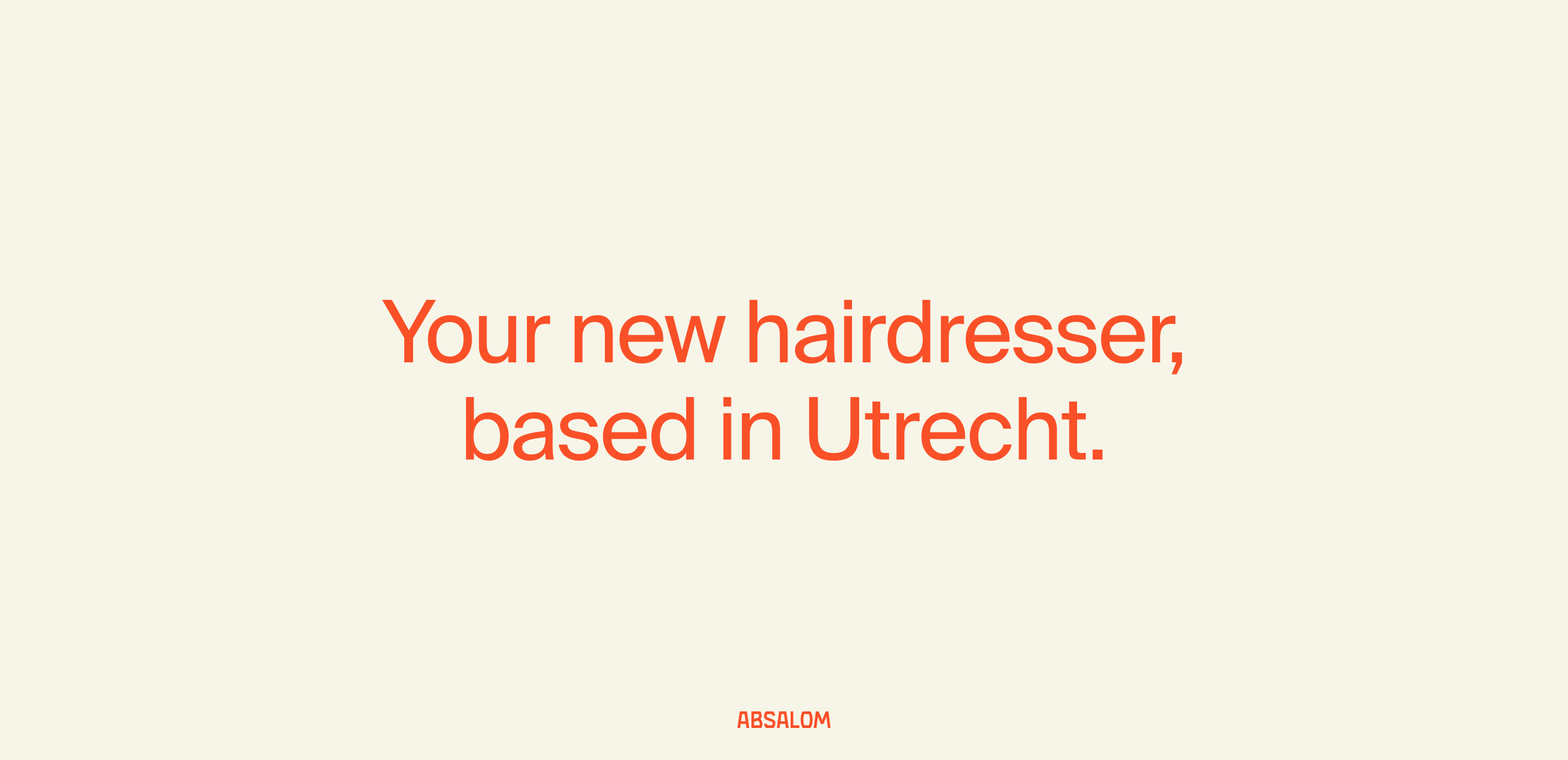
The story of the new Utrecht-based hair salon, Absalom, began with a name—a name chosen for its history and symbolism. Inspired by ‘Absalom’, the son of King David, renowned for his strikingly thick and heavy hair, the name carries a nod to strength and legacy.
Absalom
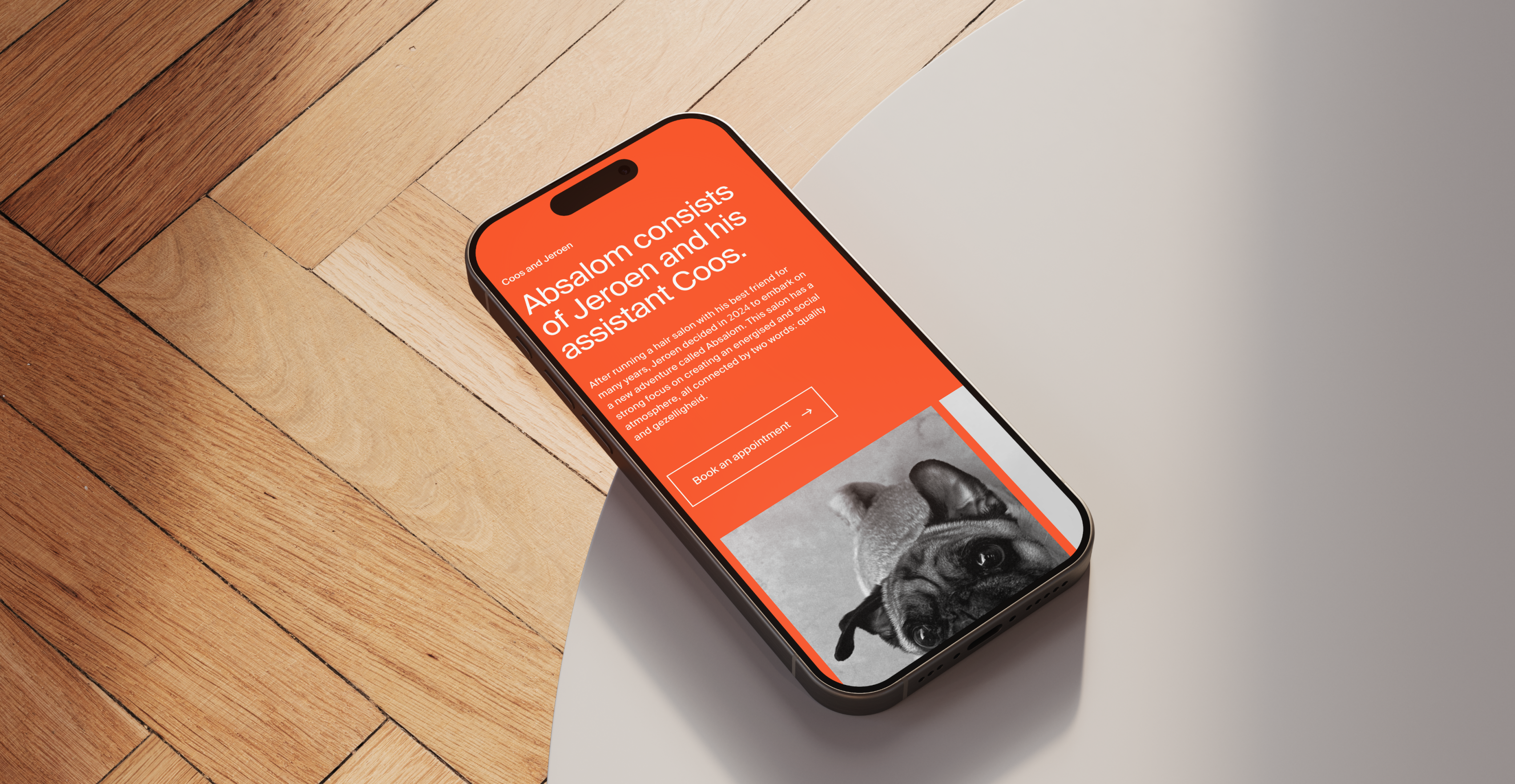
The name also subtly honours ‘Simson’, a former business connection, creating a link between past and present through powerful symbolism.
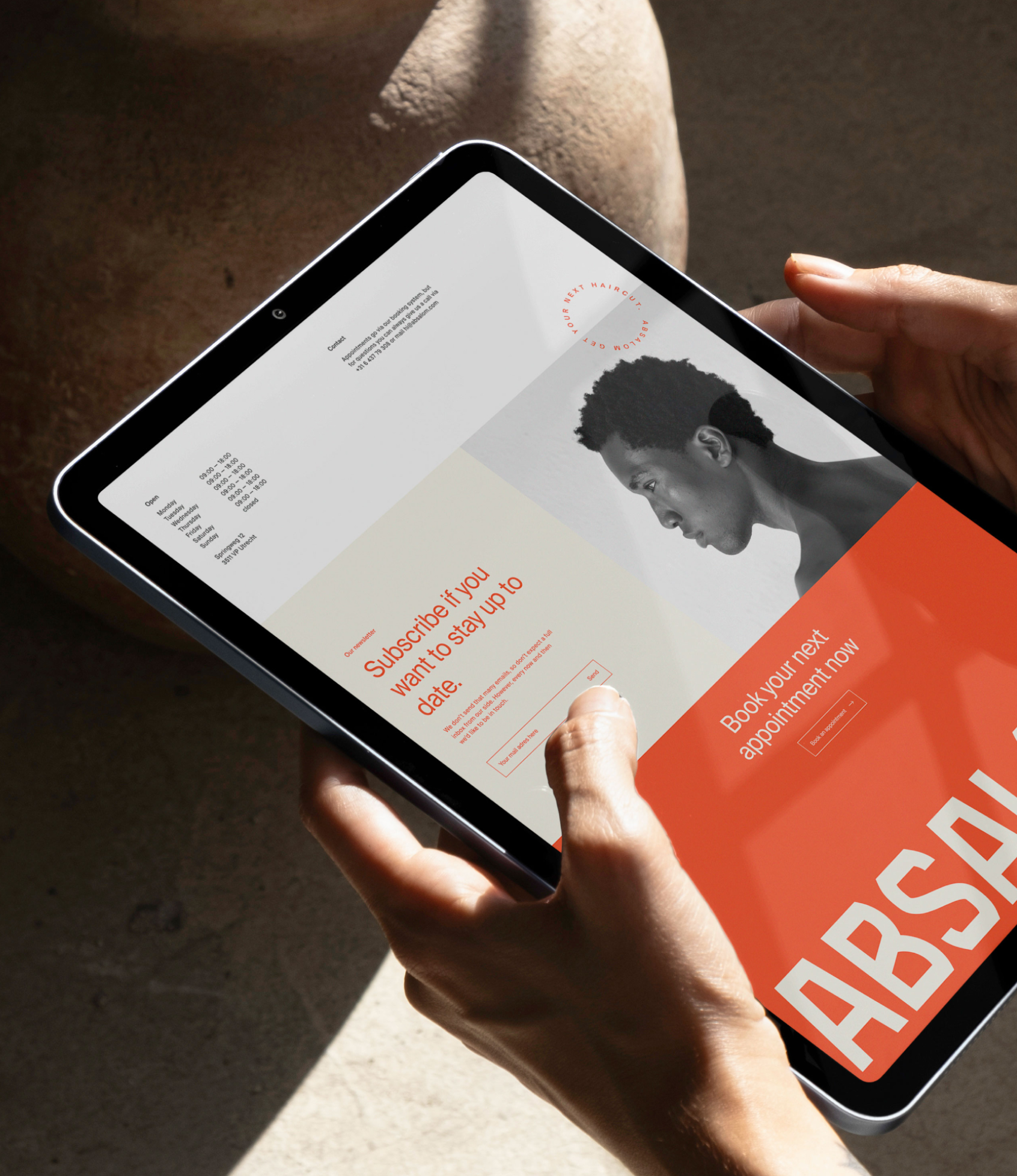
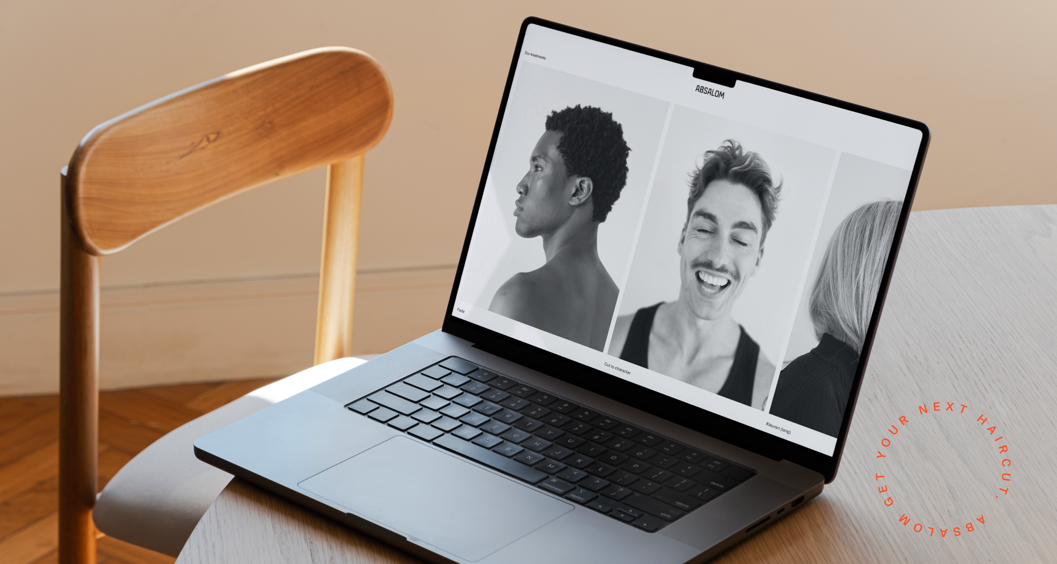
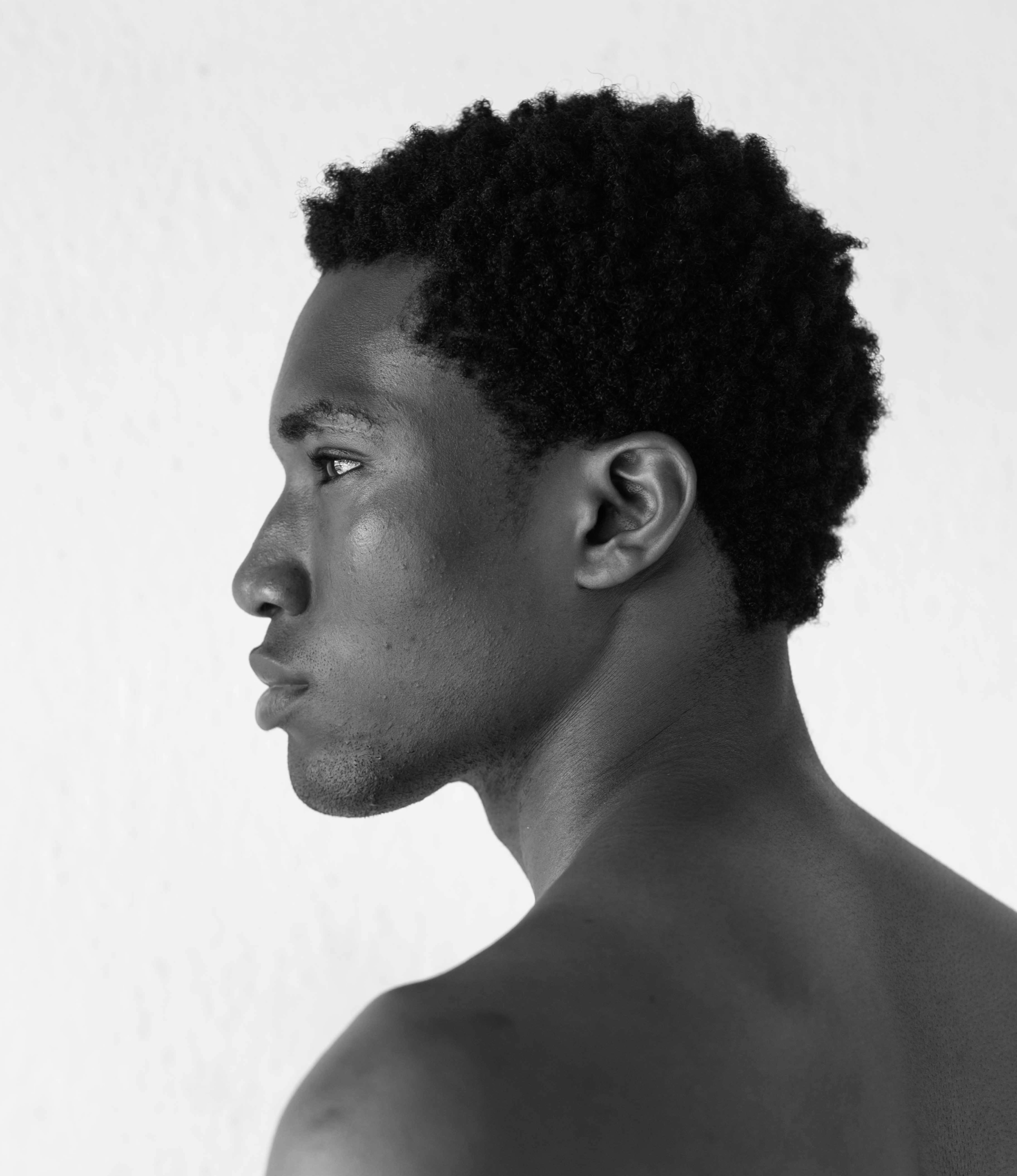
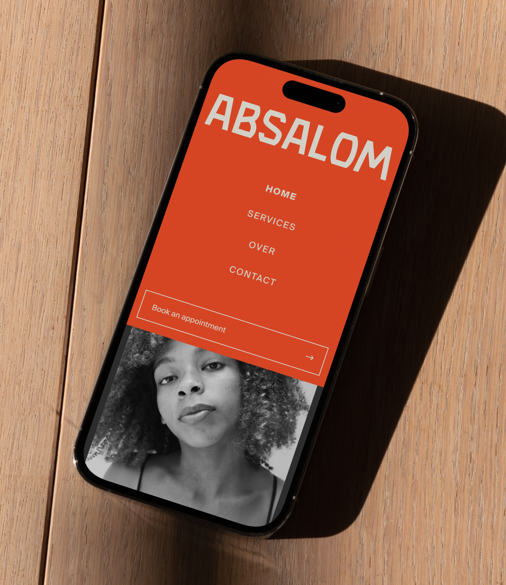
Our work for the new hairsalon was about creating a brand that feels timeless, yet unapologetically modern. The logo was designed to reflect this balance, presenting a sense of quality that’s stately and refined but with a hint of edge. It stands confidently on the page, offering a sense of calm, grounded elegance.
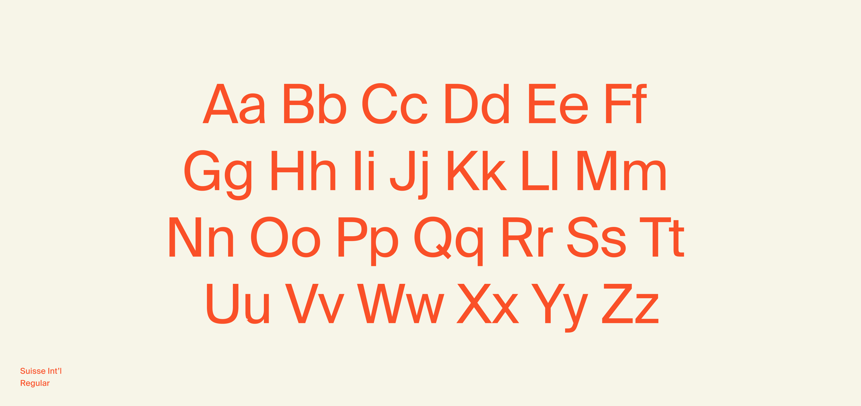
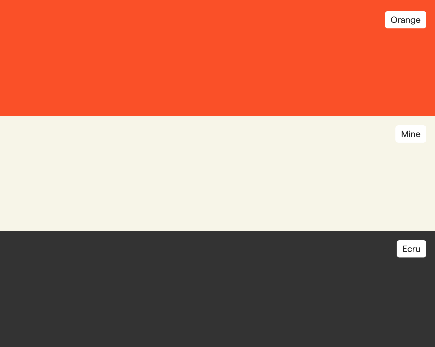
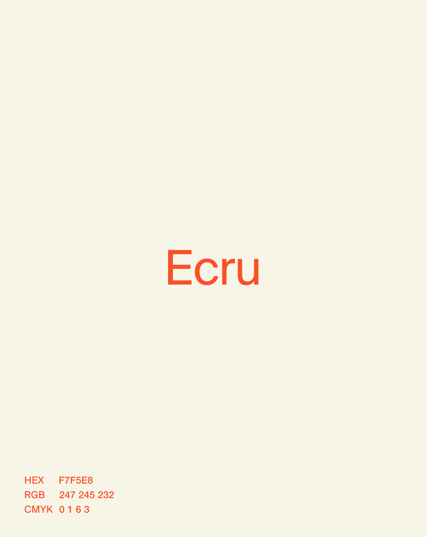
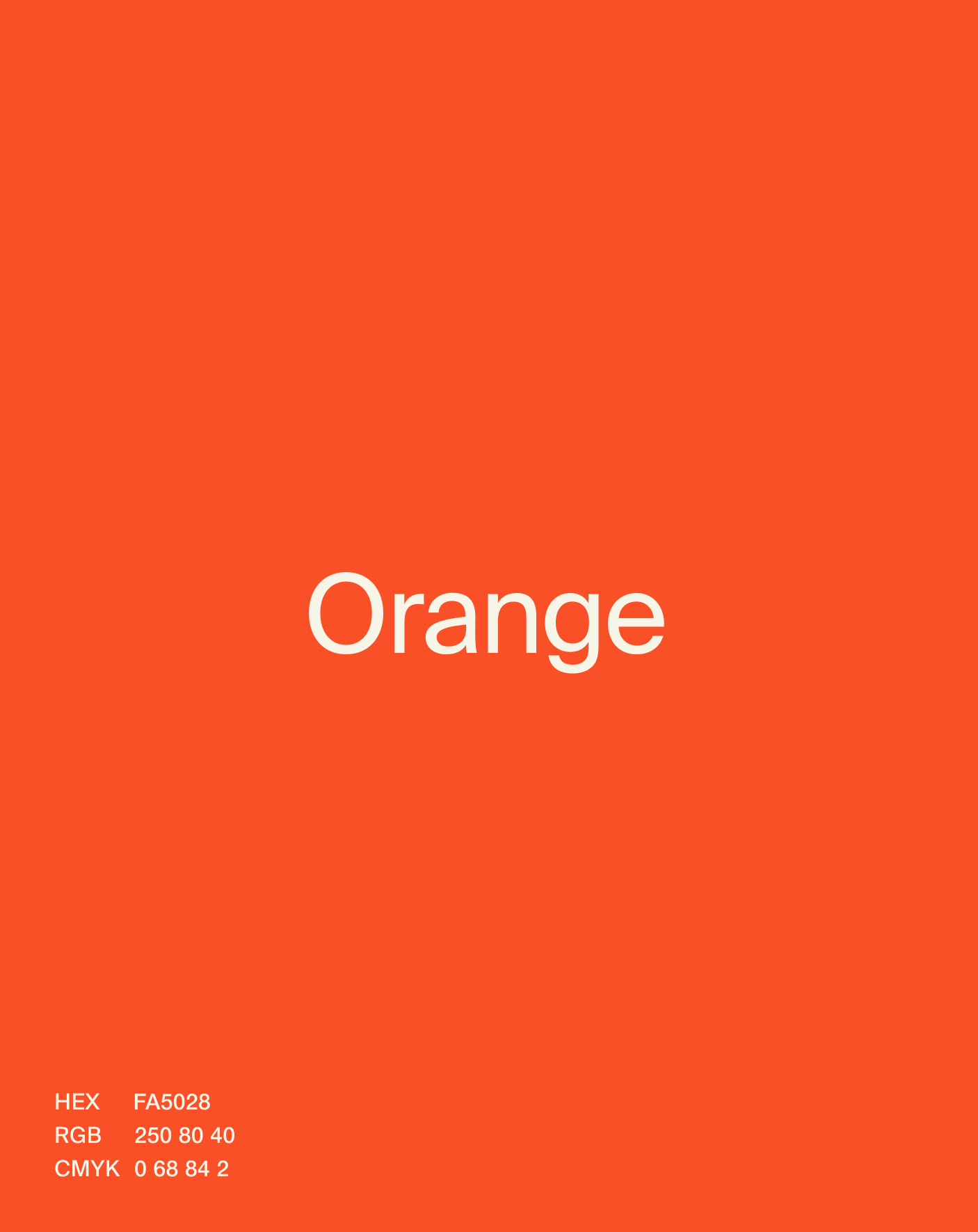
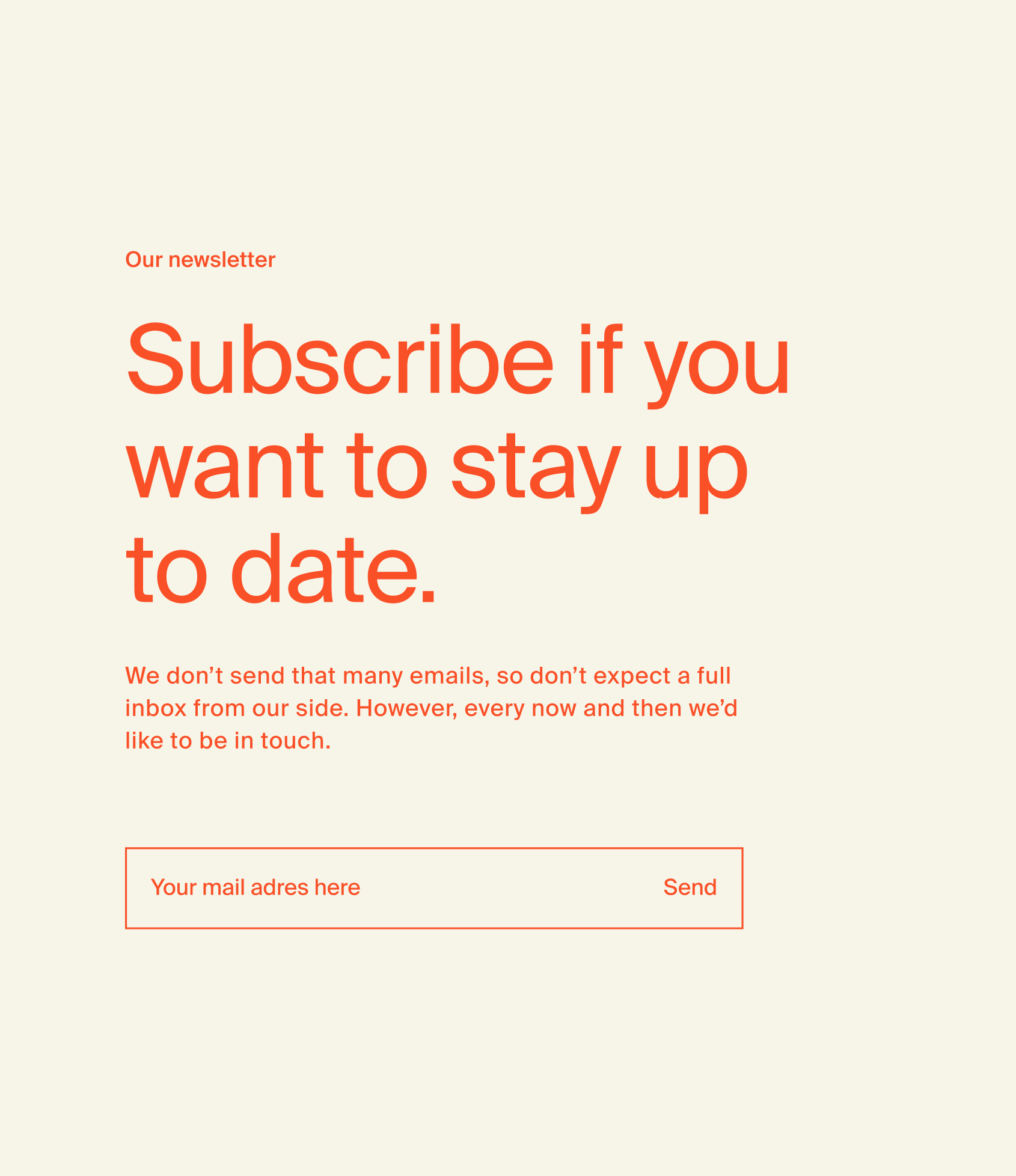
The colours of Absalom’s identity are a warm, softened orange that serves as the focal point, complemented by ample white space and ecru for elegance. A muted black adds depth, with two accent colours for versatility.
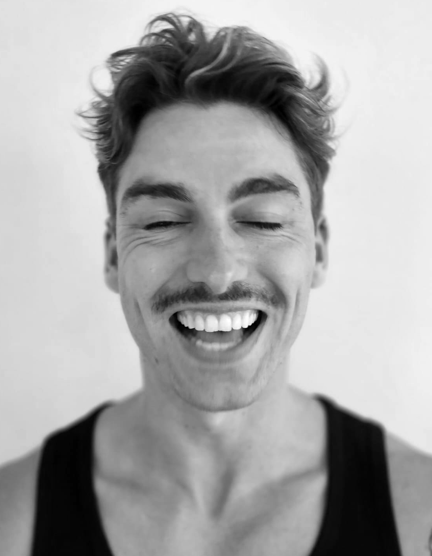
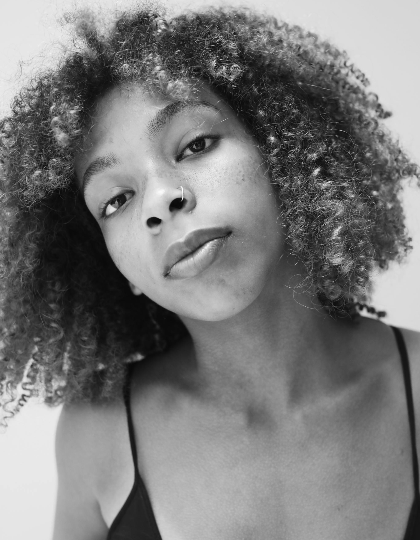
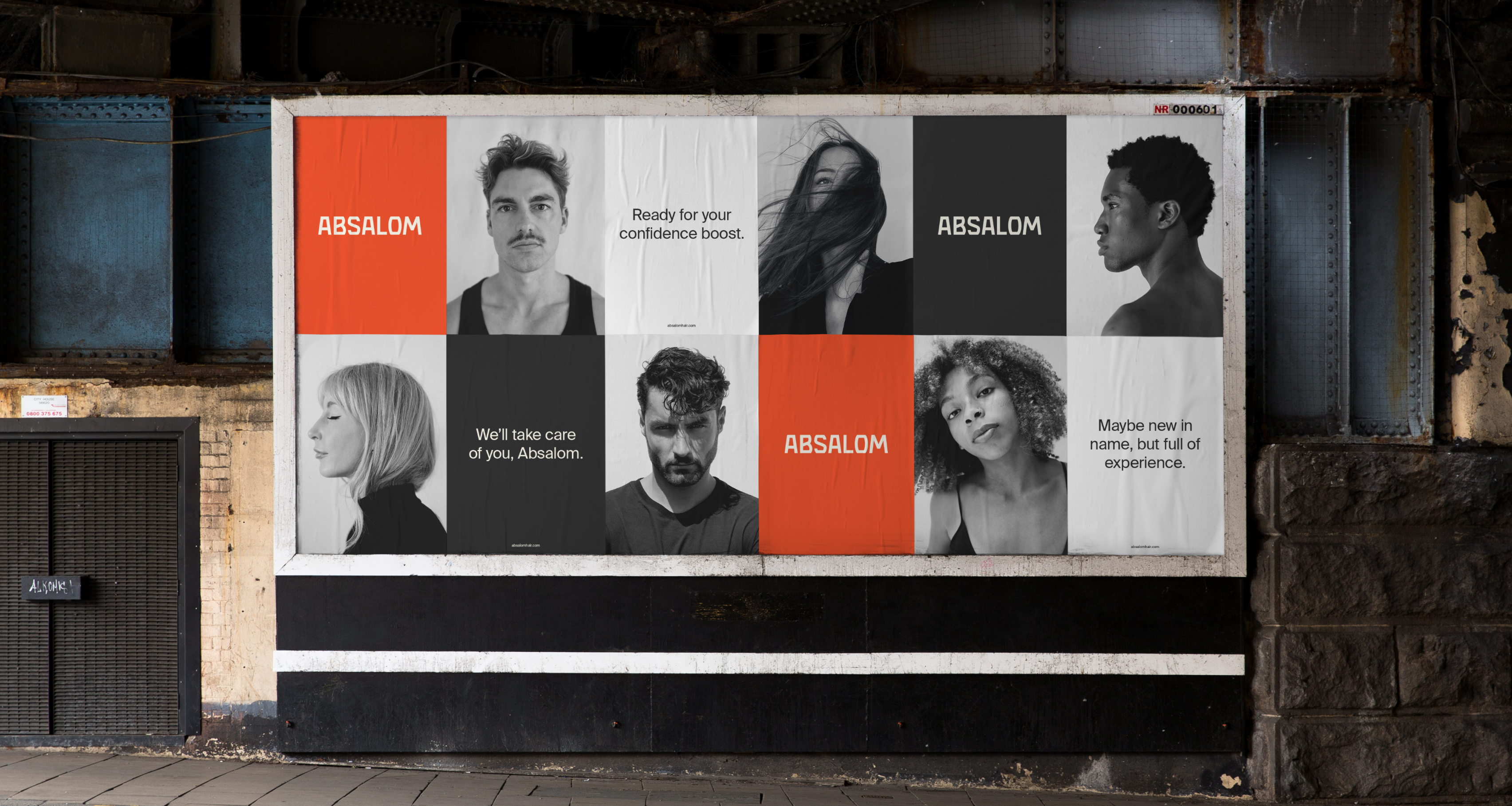
We sought to create more than just a brand identity—we wanted to tell a story of strength, heritage, and contemporary sophistication.